本文最后更新于:2023年8月7日 凌晨
看到了一些Hexo博客首页用到了打字机效果。于是思考不使用Javascript,如何实现打字机效果呢?
一个字总结:丑。
实现:利用css中animiation实现关键帧组成循环动画。width减少模仿字体被删除;border-right黑白变色模仿光标闪烁
直接上源码:
,,,,,1
2
3
4
5
6
7
8
9
10
11
12
13
14
15
16
17
18
19
20
21
22
23
24
25
26
27
28
29
30
31
32
33
34
35
36
37
38
39
40
41
42
43
44
45
46
47
48
49
50
51
52
53
54
55
56
57
58
59
60
61
62
63
64
65
66
67
68
69
70
71
72
73
74
75
76
77
78
79
80
81
82
83
84
85
86
87
88
89
90
91
92
93
| <!DOCTYPE html>
<html lang="en">
<head>
<meta charset="UTF-8">
<meta name="viewport" content="width=device-width, initial-scale=1.0">
<title>Document</title>
<style>
#demo {
white-space: nowrap;
font-family: 'Courier New', Courier, monospace;
width: 250px;
font-size: 2em;
font-weight: 700;
overflow: hidden;
animation: first 6s step-end infinite;
display: inline-block
}
#key {
margin-top: -200px;
line-height: 50px;
font-size: 1em;
color: blue;
}
@keyframes first {
0% {
width: 250px;
border-right: 3px solid black;
}
5% {
width: 250px;
border-right: 3px solid white;
}
10% {
width: 250px;
border-right: 3px solid black;
}
20% {
width: 200px;
border-right: 3px solid white;
}
25% {
width: 200px;
border-right: 3px solid black;
}
30% {
width: 200px;
border-right: 3px solid white;
}
40% {
width: 150px;
border-right: 3px solid black;
}
45% {
width: 150px;
border-right: 3px solid white;
}
50% {
width: 150px;
border-right: 3px solid black;
}
60% {
width: 100px;
border-right: 3px solid white;
}
80% {
width: 50px;
border-right: 3px solid black;
}
100% {
width: 0px;
border-right: 3px solid white;
}
}
</style>
</head>
<body>
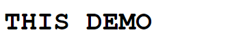
<span id="demo">THIS DEMO</span>
</body>
</html>
|